By Marco Chery – SolidXperts Application Specialist
What is an adaptive form?
DriveWorks projects created using responsive forms adjust their content regardless of the size and orientation of your device screen, whether it is a computer, tablet, or smartphone. This eliminates the need to swipe the web page from left to right to see content and the user’s browsing experience is more intuitive.
Why should you use them?
- For the dissemination of DriveWorks projects on the web;
- Improved user navigation;
- Access the project anywhere from any device.
A Few Tips
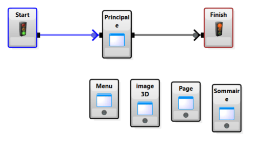
The easiest way to make your forms responsive is to use Frame Controls on the main page. From this main page, the windows will allow you to see the content of your different forms.
 First, define the location of your viewing windows for the resolution of a desktop computer.
Second, create a plan to switch these windows to the screen of a phone and tablet.
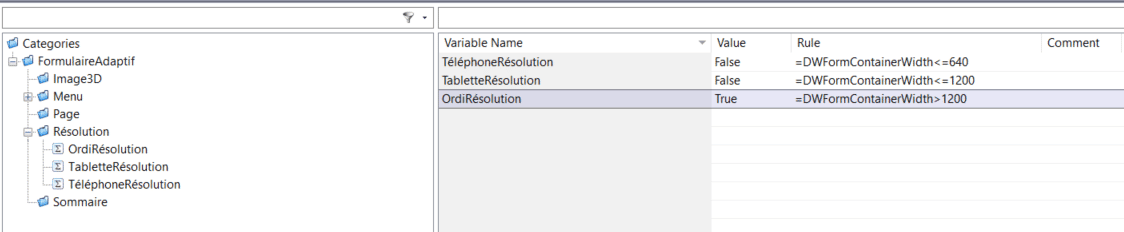
Third, determine the borders for switching windows between different device resolutions. For this, we use a special DriveWorks variable: FormContainerWidth.
- Phone Resolution: 320 – 640 pixels
- Tablet Resolution: 640 -1200 pixels
- Computer Resolution: 1200+ pixels
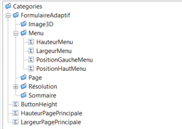
 Fourth, for each zone, we can create variables that will position the window taking into account the different resolutions.
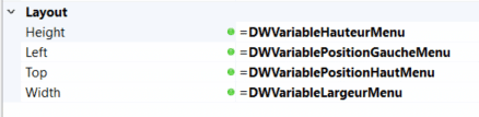
 Finally, we import the variables to the main page, in the layout section for each type of viewing window.
 Conclusion
This method ensures your DriveWorks project forms are adaptive and attractive, regardless of the device on which they are viewed.
SolidXperts teams can help you become true 3D experts! An additional question? Need information?
SolidXperts team is always there for you!
